When the Box Was the Experience: Mid-Century Design and the Lost Art of Making Objects Feel Like Gifts
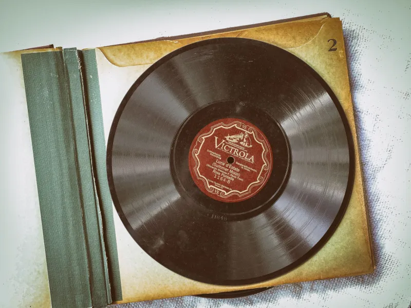
Pick up a well-preserved copy of Miles Davis's Kind of Blue — the original Columbia pressing, the one with that clean, cool blue portrait photograph and the elegant sans-serif type — and before you've heard a single note, something has already happened to you. The weight of the sleeve in your hands. The slight texture of the cardboard. The way the design communicates, without a single word of explanation, that what's inside is serious and beautiful and worth your time. That's not an accident. That's decades of intention.
The mid-century golden era of American design produced some of the most sophisticated visual communication in the history of commercial art, and for a long time, most people didn't fully recognize it as art at all. It was just the cover of a record. It was just the label on a coffee can. It was just the styling on a refrigerator. It was, in fact, a complete sensory philosophy — a belief that the experience of a product began the moment you laid eyes on it, and that every inch of that experience deserved care.
In 2024, that philosophy is having a serious moment.
The People Who Made the Records Look Like That
The story of golden era album art is largely the story of a handful of art directors and illustrators working under conditions that would make modern designers flinch. Deadlines were brutal. Budgets were tight. Photography was expensive and technically demanding. And yet the output — particularly from labels like Blue Note, Verve, Prestige, and Capitol through the 1950s and into the '60s — represents a sustained creative achievement that museums are only now beginning to document properly.
Reid Miles at Blue Note is probably the most celebrated name in the conversation. His covers — built around bold typography, high-contrast black-and-white photography (often shot by Francis Wolff), and a graphic confidence that felt European in its restraint — turned jazz albums into objects that demanded attention on a record store shelf. Miles wasn't a musician. He was a designer who understood that the cover's job was to make someone stop walking and pick the thing up. He succeeded approximately 500 times.
But Reid Miles wasn't alone. David Stone Martin's pen-and-ink illustrations for Verve and other labels had a loose, expressive quality that felt like jazz looked. Jim Flora's cartoonish, surrealist covers for Columbia in the early '50s were genuinely strange and genuinely wonderful — brightly colored, full of visual jokes, unlike anything else on the market. These men were building a visual language for American music, and they were largely doing it without anyone calling it art.
Lobby Cards, Product Packaging, and the Complete Sensory World
The album cover was just one corner of a much larger design universe. Movie lobby cards — those gorgeous printed panels that theaters displayed in their glass cases to advertise coming attractions — were another. The illustrators who painted those images (often working from still photographs and their own imagination) created a style of representational art that's immediately recognizable: vivid colors, dramatic lighting, faces rendered with a kind of idealized glamour that made every film look like the most important thing you'd ever see.
These cards were considered disposable. Theaters received them, used them for a few weeks, and threw them away or sold them for pennies. The ones that survived are now fetching serious money at auction, collected by people who recognize them as the commercial fine art they always were.
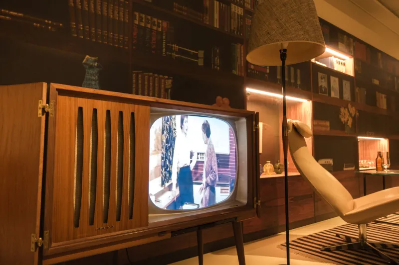
The same story plays out across mid-century product design. The industrial designers working on American appliances in the postwar period — people like Raymond Loewy, Henry Dreyfuss, and Brooks Stevens — approached a refrigerator or a radio the way an architect approaches a building. Form and function weren't in opposition; they were in conversation. The result was a generation of everyday objects that looked like they'd been considered from every angle, because they had been.
Your grandmother's Westinghouse refrigerator wasn't just a box that kept food cold. It was a statement about what the future was supposed to feel like — optimistic, clean, modern, and somehow still warm. That combination is extraordinarily difficult to achieve, and the designers who pulled it off regularly deserve more credit than history has given them.
What Digital Dismantled
The shift to digital distribution didn't just change how we access music and film. It eliminated an entire creative category. When an album becomes a 3,000-pixel JPEG thumbnail optimized for visibility at the size of a postage stamp on a phone screen, the design constraints change completely. The gatefold — that glorious double-wide canvas that allowed artists like Roger Dean, Hipgnosis, and countless others to create genuine visual narratives — becomes irrelevant. The liner notes, the credits, the photographs tucked inside the sleeve, the lyric sheets: gone.
Streaming platforms have made some attempts to compensate, but a 640x640 image on a screen is a fundamentally different object than a 12-inch square of printed cardboard in your hands. The haptic experience — the weight, the texture, the smell of old vinyl and paper — simply cannot be replicated. And that experience, it turns out, mattered more than anyone fully appreciated until it was no longer the default.
The Collectors, the Recreators, and the Instagram Aesthetes
The response to this loss has been fascinating to watch. Vinyl collecting has surged — a story Royce 59 has covered before — but it's broader than just the music. There are active communities of lobby card collectors, vintage packaging enthusiasts, and mid-century appliance restorers who are preserving this material with the seriousness of museum conservators. Etsy shops selling reproduction vintage packaging designs do steady business. Instagram accounts dedicated entirely to mid-century graphic design accumulate followings in the hundreds of thousands.
Indie brands have taken particular notice. Across categories — coffee, spirits, personal care, specialty food — there's been a deliberate aesthetic pivot toward mid-century visual language. The rounded typography, the limited color palettes, the hand-illustrated product mascots: these design choices are everywhere, and they're not random. They're communicating something specific to the consumer: this product has been considered, it has character, it comes from somewhere real.
The irony is that many of these brands are using vintage aesthetic codes to sell products through digital channels — Instagram ads, Shopify storefronts, email newsletters — that are the very opposite of the tactile, physical experience those codes originally came from. It's a fascinating tension, and it speaks to how powerful that original design language still is. Even in translation, it carries meaning.
The Designers Finally Getting Their Flowers
There's a slow but genuine critical reappraisal happening around the commercial artists of the mid-century golden era. The Museum of Modern Art has acquired Blue Note album covers for its permanent collection. Academic programs in graphic design have incorporated mid-century American commercial art into their curricula. Monographs on figures like Reid Miles and Jim Flora are finding audiences beyond specialist collectors.
This feels right and overdue. The people who designed those album covers, painted those lobby cards, and shaped those appliances were working at the intersection of art and commerce in ways that required tremendous skill and produced lasting beauty. The fact that their work was "just" commercial — made to sell something — doesn't diminish it. If anything, the constraints made the achievement more impressive.
At Royce 59, we've always held that the golden era produced things worth keeping, worth studying, and worth understanding on their own terms. The packaging was never just packaging. It was the first part of the experience, and sometimes it was the best part. The designers who understood that deserve to be remembered by name.